New Brand, New Merch
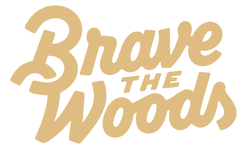
As you well know, we recently did a full Brave the Woods brand refresh. We were proud of our previous logotype and brand vibe, and it represented our business well during the time we had it, but as our company has matured, we have really figured out who we are and want to embrace that fully through our new branding.
The best example of this is our new brand colors. Our original branding had bold, bright colors to represent our fun illustration style, but now we felt the need for colors to take a backseat to the work we showcase while still giving that heritage feel. We’ve always been a bit hesitant to fully embrace our love of incorporating vintage art styles into our artwork so as to not get stuck making kitschy, retro-looking work that lacks originality. At this point, we are fully confident in our creative abilities and know we can walk that line with ease to create new and original work that feels both fresh AND nostalgic.
We decided to keep our tree shield icon because we are sentimental, and it has a lot of brand recognition at this point. It is what started it all! There have been multiple versions of our logotype over the years, but the tree shield has always stayed the same. As literal as the logo is for the name Brave the Woods, it represents so much. Our creative philosophy has always been to stay curious and be brave enough to take risks! We love the adventure of making things that bring joy and solving problems in creative ways. The tree icon may seem simple, but it represents a whole lot.
Our choice to update the logotype to script lettering was made because again, we wanted to lean into our love of making things feel a hint retro. The new logotype feels reminiscent of scripts in the 60’s, but the thicker lines help make it feel grounded in current times as well. We can’t take all the credit for the new mark though because it was created by our, then part-time employee, Ryan Peters. We asked him to explore new lettering options because he is crazy talented and we couldn’t be happier with what he came up with.
All in all, we are so proud of our new branding and are so incredibly excited to plaster it everywhere…including merch! If you haven’t visited our shop lately, you should definitely go check it out! Staying consistent with our new heritage-feeling branding, we’ve added some apparel that we think you will love. Find the new apparel and even some new Halloween goodies in our shop today!
And speaking of merch, if you are looking to make your own awesome merch, take a look at Sticker Mule! We have been using them for custom packaging materials, stickers, t-shirts and more over the past decade. Best known for their stickers, we can assure you the quality is top notch. And if you are overwhelmed with the process of turning your designs into products, they make it very easy to do through their easy to use downloadable templates and proofing process with an actual human. Imagine that! Nothing gets printed until you are happy with the mockup they provide you of your new product. Check out Sticker Mule’s custom stickers and more at www.stickermule.com


