Docket Logotype
Docket Health
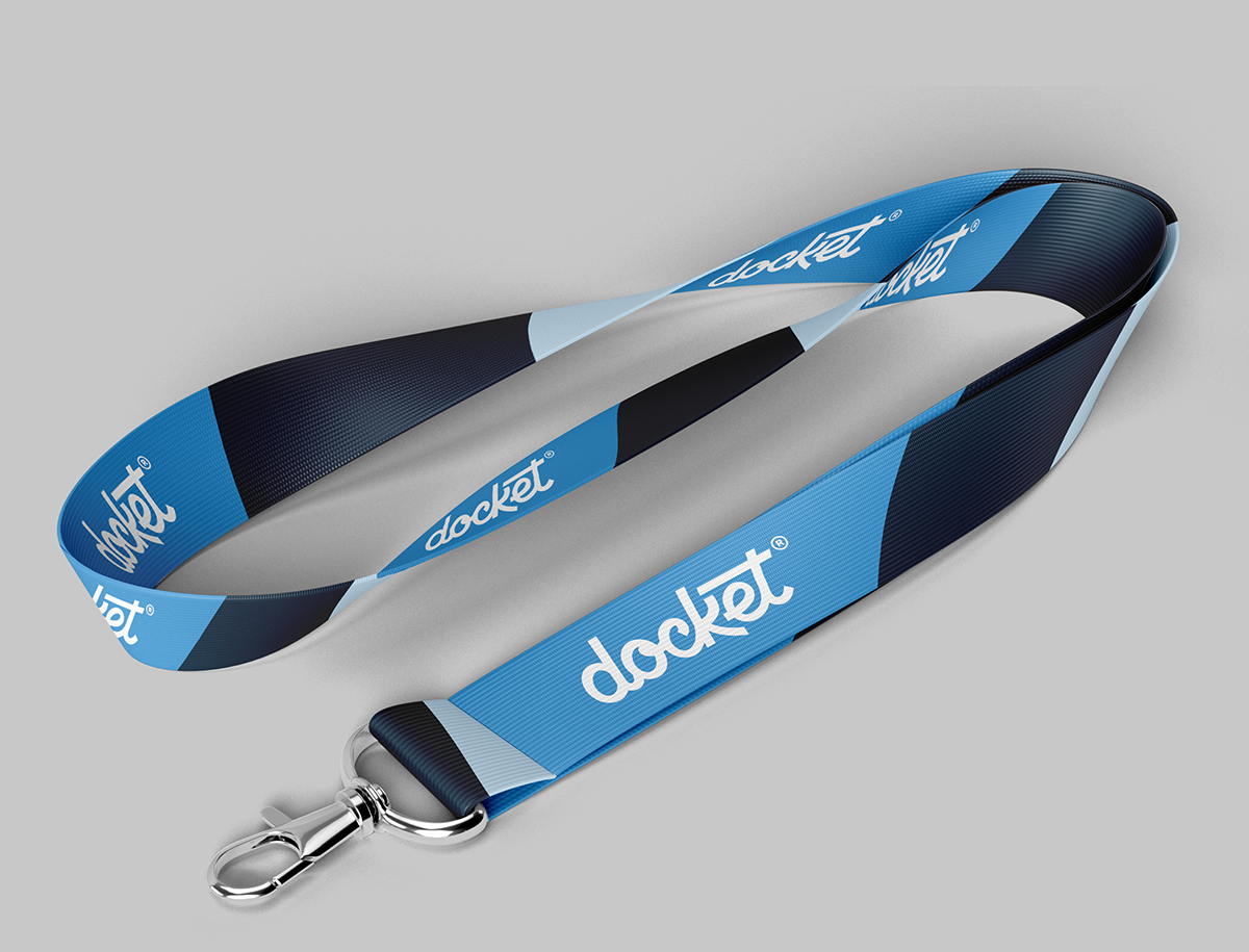
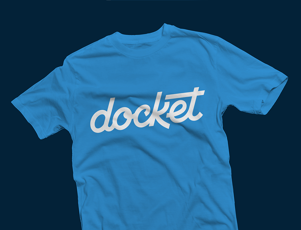
Our friends over at Docket hired us to update their logo to feel more established and legible. Their original logo had a lot of personality, so our challenge was to capture that energy, just grow it up a bit. And we did just that, all with custom lettering.
Design Lettering
OUR ROLE:

The Process
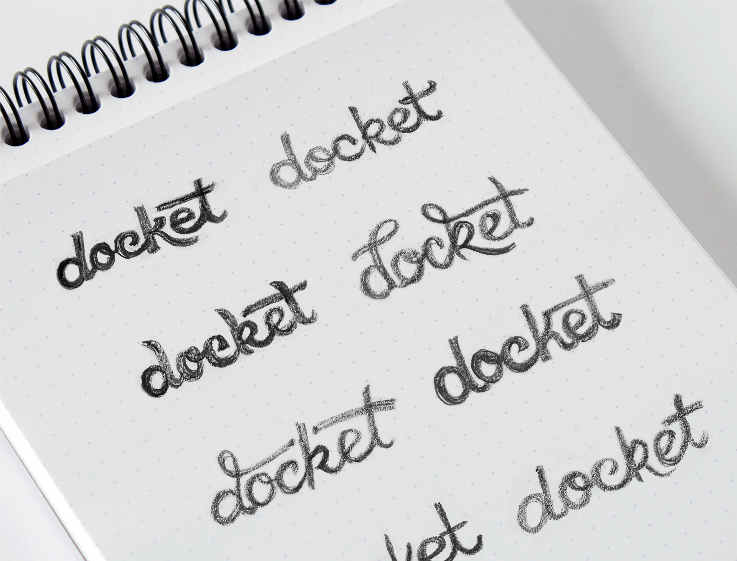
For any logotypes we create, we always start with scribbling out ideas and letterforms on paper. The brief on the Docket logo was to not stray too far from the original logo so that clients and users could still recognize their established company. That led to us sticking with a script style, but making it feel more professional and unique.
After getting feedback on our rough sketches the client hand selected several directions they wanted to see cleaned up so they could decide on a final direction. Luckily for us, we all agreed on the final direction which only left vectorizing the sketch and making some little tweaks to make it perfect.

